Terashima Design Co.
Works
About
Office
Category
Book
Branding
Flyer
Magazine
Others
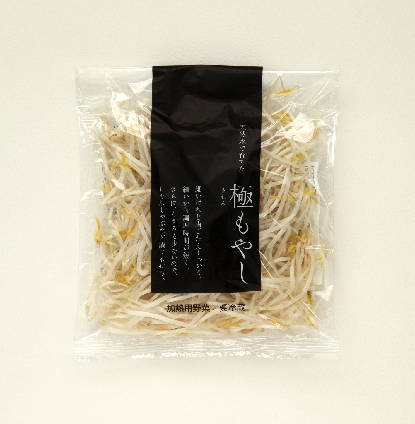
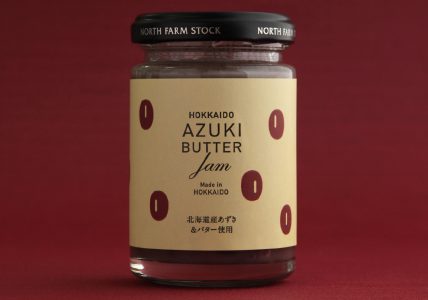
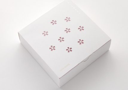
Package
Poster
Product
Sign
Vl & Logomark
Staff
MASAYUKI TERASHIMA
SAKI KOUGENJI
MIYUU NISHIMOTO
MOMOE SATO
ASAMI HORIE
Blog
1 / 11
1
2
3
4
5
...
10
...
»
最後 »