Japan Campaign to Ban Landmines
NO LANDMINE ポスター
2005
- AD,D : MASAYUKI TERASHIMA
ふと思いついたアイデアをポスターにしてしまったひとつ。
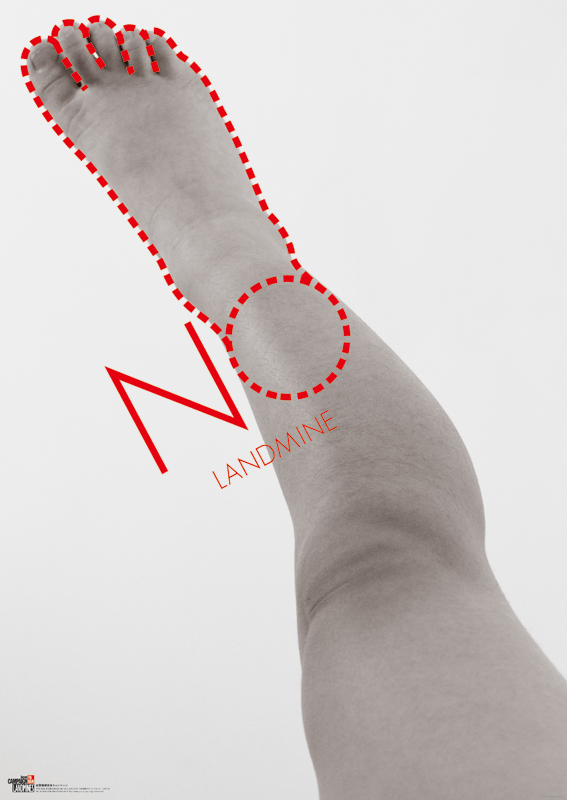
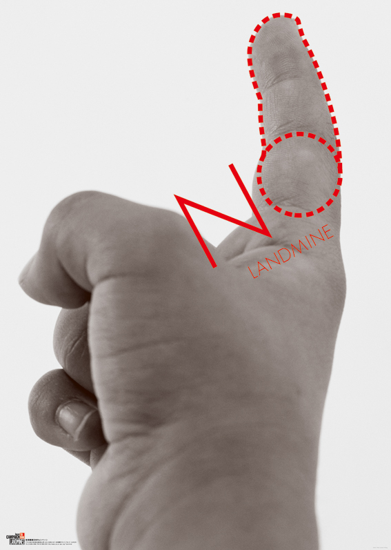
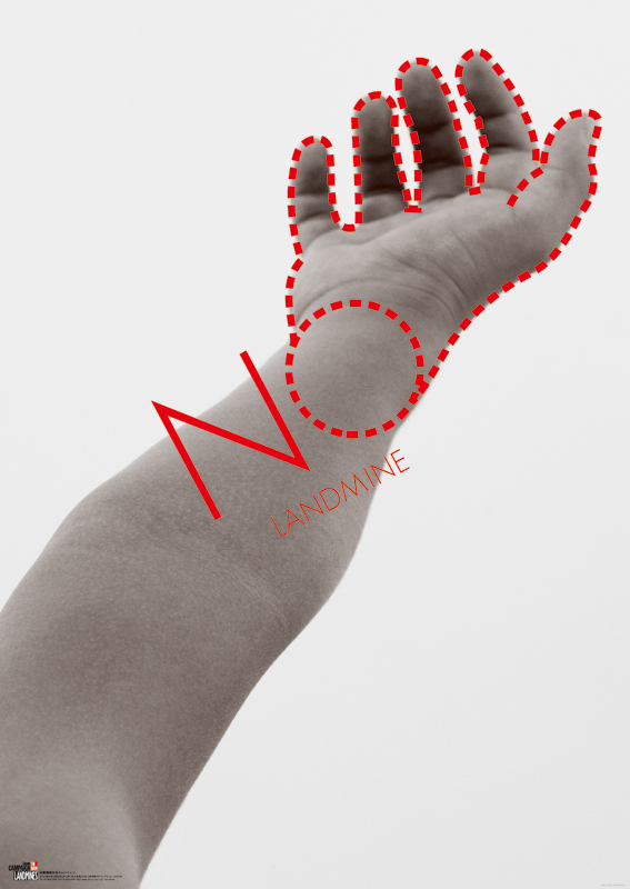
地雷をイメージさせるなら切断された腕や足のヴィジュアルが強いけれど、
きっと誰かがやっていそうな気がしたので、切断された“切り口”でできないかと考えたんですね。
切り口は丸いのでアルファベットの「O」にみたてました。
「O」の前後において単純で意味のある単語と言えば、ON、OFF、FOR、TO、GOOD、DOなど。
あてはめる言葉によってはいろんな意味になりそうですが「NO」を選んでストレートなメッセージにしたわけです。
点線にすると切り取られた感じもでますしね。
思いついてからここまで考えるのに15分ぐらい。次はクライアント探しです。
インターネットで「地雷」を検索してNGOなどをいくつか見つけました。
その中の「地雷廃絶日本キャンペーン」というところに電話して、ポスターをプレゼントするのでロゴを入れさせてほしいと依頼。
制作費もかからないので快諾してくれました。
撮影は20代のころから仕事をしている米山均さんと。
彼も作品づくりとなると理解があってノーギャラでやってくれました。
被写体の手や足は当時7歳だったうちの長女。
じっと動かずにいるのはけっこうたいへんだったけれど、がんばってくれました。
本当は4枚シリーズで顔が写ったものもあるんですが、
今は大きく育った彼女が強硬にいやがるのでお見せするのは3枚だけにしときます。
One of the posters to design with a hit on idea.
To image landmines, mutilated arm or leg give a strong visual impact, but other creators might think the same, and so I decided to use as “one angle.”
A round cut end surface was expressed by an alphabet “O.” Simple words with “O” combined another alphabet are; ON, OFF, FOR, TO, GOOD, DO, etc. Each word could link to various meanings, and I chose “NO” to give a straight message.
Dotted lines added expression of cutting. It took me about 15 minutes to think this far. Next thing was to find a client. By searching on the Internet for “landmine” and found some NGO. I called one of them, Anti-landmines Campaign in Japan, and asked them to use the logo free for their posers. They consented soon as there were no fees concerned.
For the shooting, I asked Hitoshi Yoneyama, a photographer I had been working since my 20’s. As he had understandings for creating works, and did it for me with no fees.
The model for arm and leg was my older daughter who was 7. It had to be difficult to keep posing, but she did great, We took photos with a series of 4 including showing her face, but only three of them were shown here. My daughter strongly resisted to show the last one, as she had grown up now.